What Makes Placemats Look Luxurious at Home?
A dining table can be beautifully made and still feel unfinished. Often, the missing element is not another centerpiece or a more formal set of dishes. It is the surface beneath each place setting. Understanding what makes placemats look luxurious comes down to recognizing how color, proportion, material, and artwork work together to make a table feel considered.
Luxury is not about making every meal formal. It is about giving everyday rituals a stronger visual point of view. A well-chosen placemat brings order to a casual breakfast, richness to a dinner party, and a sense of intention to the table even when the rest of the setting stays simple.
What Makes Placemats Look Luxurious?
The most elevated placemats do more than protect the table. They create a frame for the plate, echo the room’s palette, and introduce texture or artwork with confidence. Their appeal is immediate, but it is rarely accidental.
A luxurious look usually comes from restraint paired with a strong design decision. That might mean a painterly floral in saturated color, a crisp geometric pattern with room to breathe, or a tonal design that adds depth without competing with the dinnerware. The key is that the placemat looks purposeful, not like an afterthought pulled from a drawer.
Artful color with real depth
Color is one of the fastest ways to shift the mood of a table. Rich jewel tones, softened earth shades, inky neutrals, and well-balanced brights can all look premium when they feel deliberate. What tends to look less refined is a palette that is muddy, overly busy, or disconnected from the room around it.
Vivid printed art can be especially effective because it gives the table a distinct identity. A strong botanical, abstract, coastal, or modern pattern can become the visual anchor of the setting, allowing white plates and clear glassware to feel more elevated by contrast. With sublimation-based artwork, color clarity matters: clean detail and lasting saturation help a design retain the polished presence that first made it appealing.
Consider the colors already in view. Pulling one tone from artwork on the wall, dining chairs, cabinetry, or a nearby rug makes a tabletop feel integrated rather than decorated in isolation. A deep green placemat can make simple cream stoneware feel intentional. A warm ochre pattern can bring life to a neutral kitchen without requiring a full seasonal redesign.
A finish that looks considered
Luxury is often felt before it is explained. The visual finish of a placemat matters just as much as the pattern printed on it. A clean surface, crisp edge, smooth construction, and consistent shape signal care. When placemats curl at the corners, look thin, or have uneven printing, even a beautiful table setting can lose its polish.
That does not mean every upscale table needs heavily textured linen or stiff formal materials. In fact, easy-care placemats can look exceptionally refined when the design is sharp, the surface is substantial, and the finish is neat. For many homes, the ability to wipe down a placemat after pasta night or a patio lunch is part of the luxury. Beautiful objects that require too much caution are not always the most enjoyable to live with.
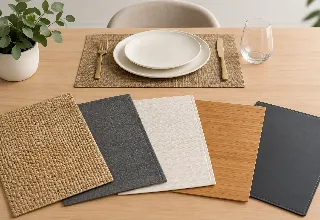
The trade-off is visual character. Natural fibers bring irregular texture and a relaxed, collected feel, but may wrinkle or stain more easily. Printed placemats offer greater freedom with detailed art and color, along with practical maintenance. The right choice depends on whether your table needs a tailored foundation, an expressive focal point, or both.
Proportion Is a Quiet Luxury Cue
Scale is easy to overlook, but it has an outsized effect. A placemat should give a place setting room to settle. If it is too small, the plate can look crowded and the entire setting feels improvised. If it is dramatically oversized for a compact table, the design can feel heavy and limit space for serving pieces.
For most dining tables, the placemat should comfortably hold the dinner plate, flatware, and glassware without forcing everything into a tight arrangement. Rectangular placemats naturally emphasize the length of a table and tend to suit more traditional or tailored settings. Round placemats soften a square or round table and add a more sculptural note. Organic silhouettes can feel artistic and relaxed, especially when paired with simple dishes.
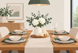
Spacing matters, too. Each guest should have a clear visual zone. When placemats nearly overlap or press against one another, the table can feel cluttered before food ever arrives. A little negative space is one of the most reliable ways to make a setting look more expensive.
The plate-and-placemat relationship
The plate should not disappear into the pattern, nor should it make the placemat seem irrelevant. High contrast can be striking: white dinnerware against a dark floral or colorful abstract creates instant definition. A tonal approach can be equally elegant, such as matte black plates over a charcoal design with subtle movement.
If the placemat is the art piece, keep the dinnerware relatively quiet. If the dishes are patterned or highly decorative, choose a placemat with enough open space to support them. Luxury comes from visual balance, not from layering every available detail onto the table.
Styling That Feels Collected, Not Overdone
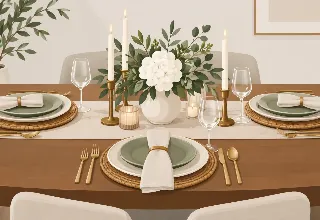
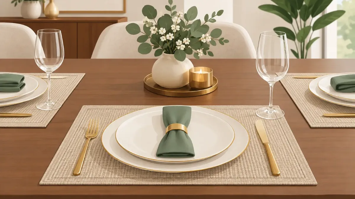
Placemats look their best when the rest of the setting leaves room for them. A single polished napkin, low-profile glassware, and simple flatware can be enough. For a more celebratory meal, add a runner, candles, or seasonal stems, but let one element lead.
A common mistake is treating a placemat as a background layer and then hiding it beneath chargers, oversized arrangements, and too many decorative objects. If you selected it for its artwork, allow the design to be seen. Centerpieces should be low enough for conversation and narrow enough that guests still have visual space at their seats.
There is also no rule that placemats must match every object exactly. Coordinating is more sophisticated than matching. A navy-and-terracotta pattern, for example, may pair beautifully with rust napkins and smoky glassware without needing a navy table runner. The shared color story creates cohesion while the variation makes the table feel personal.
For everyday use, repeat one or two finishing details. Fold napkins the same way, use the same water glasses, or place a small bowl of citrus at the center. These gestures make the table look styled without making dinner feel staged.
Match the Mood to the Occasion
The placemats that feel luxurious at a holiday dinner may not be the ones you reach for on a Tuesday. That is a strength, not a problem. A small collection lets you change the atmosphere of a room quickly.
For relaxed meals, choose artwork with warmth, movement, or playful color. For evening entertaining, darker grounds, metallic-inspired details, fine linework, or layered tonal designs can bring a more dramatic mood. Outdoor tables benefit from designs that hold their own against natural light and greenery. In a small apartment, one expressive set of placemats may do more for the dining area than another large decor purchase.
This is where art-led tabletop pieces earn their place. A set of SubliLux placemats can shift the feeling of a table in seconds, adding a designed finish without changing the furniture, paint color, or dinnerware cabinet.
Care Preserves the Premium Look
Even the most beautiful placemat stops looking luxurious when it is visibly worn, stained, or stored carelessly. Follow the material’s care directions, clean spills promptly, and avoid folding placemats where permanent creases might form. When storing multiple sets, keep them flat where possible so the edges remain crisp.
Rotate designs rather than relying on one set for every meal. This helps preserve their finish, but it also keeps the table visually fresh. A familiar room can feel newly styled when the colors beneath the plates change.
The most luxurious placemats are not necessarily the most formal or the most expensive-looking at first glance. They are the ones that make your table feel complete: clear in color, balanced in scale, beautiful in finish, and easy enough to enjoy often. Start with a design that you genuinely want to see across the table, then give it the space to do its work.