A Guide to Premium Tabletop Styling at Home
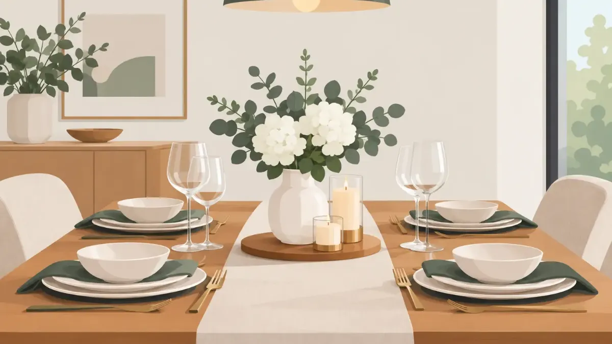
A dining table can occupy the center of a room and still feel like an afterthought. The difference is rarely a complete renovation or a cabinet full of formal dinnerware. It is the visual discipline of the surface itself. This guide to premium tabletop styling begins with that idea: create a setting with a point of view, then let each piece earn its place.
Premium styling is not about making a table look untouchable. It is about choosing color, pattern, finish, and proportion with enough intention that a Tuesday breakfast feels considered and a dinner party feels effortless. Artistic placemats are especially effective because they establish that visual point of view in seconds, while still protecting the table beneath.
Start With a Premium Tabletop Styling Anchor
Every polished table needs an anchor. In many settings, that anchor is the placemat. It frames each seat, gives dinnerware a defined stage, and introduces the color or artwork that sets the mood for everything else.
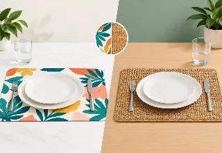
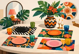
Choose placemats before selecting accent pieces. A vivid botanical print may call for simple white stoneware and clear glassware. A graphic black-and-cream design can support sculptural candleholders, smoked glass, or a dark linen napkin. A soft watercolor pattern may look best with warm neutrals, natural fibers, and low floral arrangements.
The goal is not to match every color exactly. Exact matching can make a table feel more like a catalog display than a home. Instead, identify one dominant color, one supporting neutral, and one small accent. If the artwork includes cobalt, sand, and a note of coral, let cobalt lead, use sand for grounding, and repeat coral only once or twice in a napkin, bloom, or small serving piece.
A premium placemat should also have enough visual presence to work on its own. This matters for everyday meals, when you may not want to bring out chargers, runners, or centerpieces. Art-led designs from SubliLux make that single-layer approach feel complete rather than spare.
Let the Table Shape Guide the Layout
A round table favors a more open composition. Use round or softly edged placemats when possible, keep the centerpiece compact, and allow room for the table shape to remain visible. On a rectangular table, repeated placemats create a pleasing rhythm, especially when the center is kept low and linear.
For a square table, restraint matters. Four full place settings, a generous floral arrangement, and a large serving board can crowd the surface quickly. Let the placemats provide most of the pattern, then add one centered object with a clean silhouette.
Build Color With Confidence, Not Clutter
A strong tabletop often begins with contrast. Light plates against a dark or saturated placemat feel crisp. Dark stoneware over a pale printed ground feels dramatic and modern. Tone-on-tone styling can be equally refined, but it depends on texture to avoid looking flat.
Consider the room around the table as part of the palette. If your kitchen has warm wood cabinets, an olive, rust, or deep blue placemat can create depth without fighting the existing finishes. In a white dining room, high-color artwork can act as the room's focal point. For an apartment with limited square footage, a coordinated table can deliver a noticeable style shift without adding visual bulk.
Avoid introducing too many competing patterns. Patterned placemats with patterned dinner plates and a patterned runner can work, but only when one element clearly dominates and the others are quieter in scale. For most homes, pair a statement placemat with solid dinnerware or subtly textured ceramics. The result reads collected, not busy.
Lighting changes color, too. A print that looks cool and graphic in daylight may appear richer under warm pendant lights. Before hosting, set one place at the table in the evening and check how the colors relate to the room. It is a small step, but it prevents a carefully chosen palette from feeling unexpectedly dull or overly intense after sunset.
Layer Texture, Then Leave Breathing Room
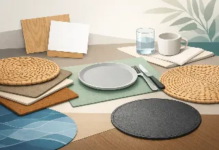
Luxury is often sensed through contrast in finishes: matte ceramic beside polished glass, woven linen against a smooth printed placemat, brushed metal near organic wood. These differences give a tabletop dimension without requiring more objects.
Begin with the placemat, add the dinner plate, and then decide whether a charger is useful. Chargers are most effective when the table is large enough to support the extra scale or when the occasion is more formal. On a smaller table, a charger can make each place setting feel crowded. A generous placemat with a beautifully shaped dinner plate often provides all the layering you need.
Napkins deserve more attention than they usually receive. Fabric napkins add softness to vivid artwork and make a place setting feel finished. Fold them simply beside the plate, tuck them beneath a bowl edge, or use a low-profile ring. Elaborate folds can feel dated unless the event itself is intentionally formal.
A table runner is optional, not mandatory. Use one when it creates a distinct visual path down a long table or when it brings texture that the setting lacks. Skip it when the placemats already have strong artwork, particularly if the runner would cut across the design at every seat. Premium styling has room to breathe.
Make Proportion Feel Effortless
The most expensive-looking table settings are usually governed by scale. Plates should sit comfortably within the boundaries of the placemat. Glassware should not crowd the plate, and centerpieces should not force guests to peer around them.
For everyday dining, use one water glass, one plate, and the flatware you need. This simple arrangement gives artistic placemats room to be seen. For a dinner party, add a wine glass, salad plate, or small bread plate only if each item has a purpose. More pieces do not automatically create a more elevated experience.
Centerpieces should be low enough to preserve conversation or tall enough to rise well above sightlines. The awkward middle is a dense arrangement at eye level. A cluster of small bud vases, a shallow bowl of seasonal fruit, or a pair of sculptural candleholders often works better than one oversized arrangement.
Candles add polish, but fragrance requires care. Strongly scented candles can compete with food, especially at dinner. Choose unscented tapers or votives for the table, and reserve fragrance for another part of the room.
Style for the Occasion Without Starting Over
A well-chosen placemat collection makes seasonal styling less complicated. Rather than replacing every element, change the mood through a few supporting details. In spring, pair floral or bright abstract artwork with clear glass and fresh green stems. Summer settings can take bolder color, striped napkins, and citrus in a simple bowl. For fall and winter, shift toward deeper linens, warm metallic accents, or darker glassware.
The same principle applies to hosting. A casual brunch benefits from open space, low vessels, and relaxed napkin placement. An evening dinner can take more contrast: darker plates, candlelight, and cloth napkins with a more tailored fold. A holiday table can be expressive, but it still needs a visual hierarchy. Let one element carry the celebration rather than asking every piece to do it.
For outdoor tables, prioritize materials that are easy to wipe clean and designs that retain their color through frequent use. Wind, bright sun, and casual serving call for a setting that looks intentional without becoming precious. The premium choice is often the one guests can enjoy without worrying about it.
Protect the Look Through Everyday Use
A styled table only earns its place in the home if it works on an ordinary day. Choose surfaces and textiles based on how you actually eat. Families with young children may prefer wipeable placemats and fewer breakable layers. Frequent hosts may value a larger rotation of designs so the table can feel fresh across seasons. A quiet household may be able to favor more delicate linens and handmade ceramics.
Maintenance also affects the visual result. Wipe placemats after meals rather than letting residue build up around the edges. Store them flat when possible so they retain a clean shape. Keep ceramic pieces free of utensil marks, polish glassware before guests arrive, and use felt protectors beneath centerpieces that could scratch the table.
There is no need to preserve a premium table for rare occasions. The best settings become part of a home's rhythm. They make takeout feel more composed, give family meals a sense of occasion, and create a backdrop for the people gathered around them.
Edit Before Guests Sit Down
Before the first glass is poured, take one step back from the table. Remove anything that blocks conversation, repeats a color without adding interest, or occupies space merely because it was available. This final edit is where a good table becomes a refined one.
Keep the artwork visible, the place settings comfortable, and the center clear enough for food and conversation. A premium tabletop does not ask for attention through excess. It holds attention because every color, texture, and object feels chosen.