How to Style a Formal Dining Table With Art
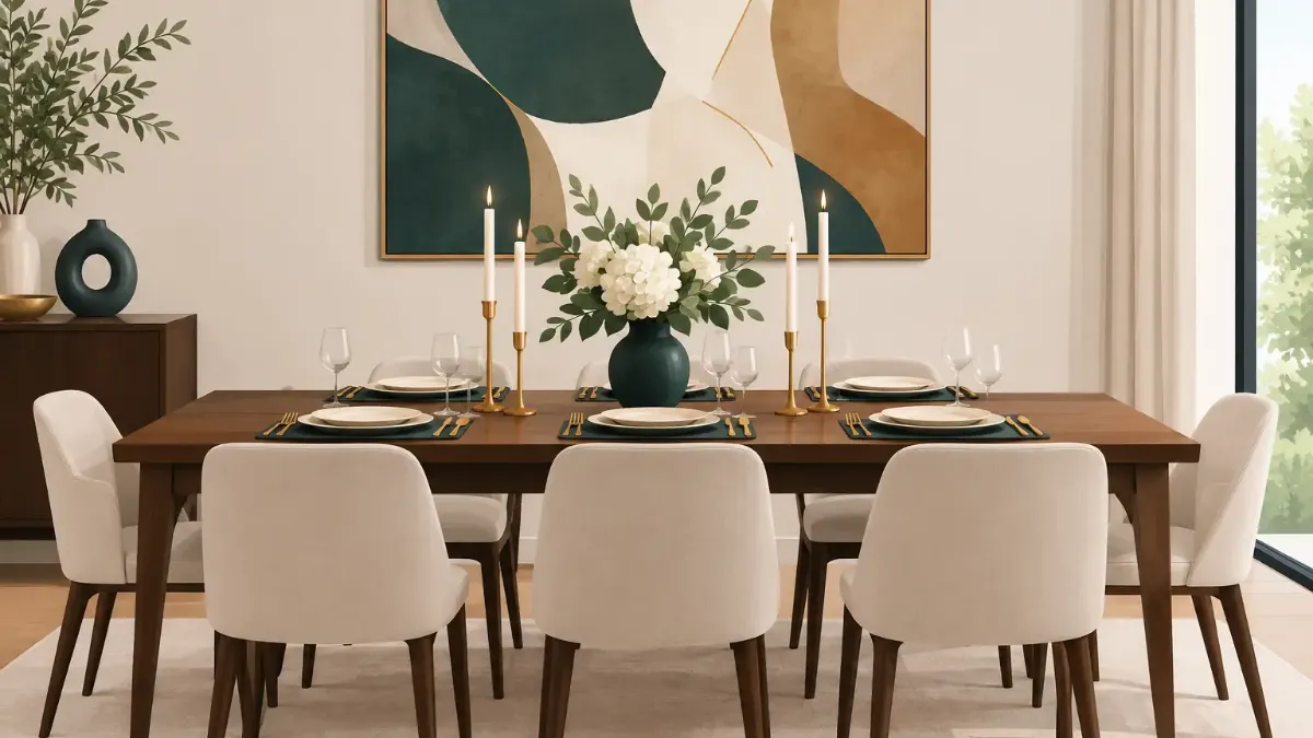
A formal table should feel composed, not overworked. To style a formal dining table well, begin with the visual decision guests notice first: the color, pattern, and texture that frame every place setting. Once that foundation is right, china, glassware, linens, and florals have a clear role rather than competing for attention.
Formal does not have to mean stiff or traditional. It can be dark and dramatic, quietly tonal, colorful and artistic, or crisp in black and white. The common thread is intention. Every layer should support the same visual point of view.
Start With the Table’s Point of View
Before setting a plate, look at the room as a whole. A walnut dining table, pale stone tabletop, antique sideboard, contemporary pendant, or view toward the garden already creates a mood. A formal setting works best when it extends that mood instead of introducing an unrelated theme.
Choose one leading direction: rich jewel tones, warm earth colors, tailored neutrals, coastal blue, botanical color, or graphic contrast. Limit the table to two or three dominant colors, then use a small accent in metallic, glass, or natural greenery. This gives the eye a place to rest while still allowing the setting to feel special.
For an evening dinner, deeper colors and candlelight naturally create ceremony. A lunch gathering often calls for more air around the setting - lighter linens, clear glass, and a centerpiece with a lower profile. Neither approach is more formal. Proportion and editing matter more than a prescribed palette.
Build Each Place Setting in Layers
The placemat is the architectural base of a place setting. It establishes spacing, protects the table, and introduces the color or artwork that ties the full arrangement together. An art-led placemat can do the work of a charger while offering more personality, particularly when the table itself is simple.
Set each placemat evenly, with enough space between guests that elbows and stemware do not crowd. Center the dinner plate on top. If you are using a salad plate or soup bowl, let the plate stack add height, but avoid piling on pieces that will not be used. Formal hospitality is thoughtful, not excessive.
Napkins bring the next opportunity for contrast. A smooth cotton or linen napkin keeps an expressive patterned placemat in focus; a patterned napkin suits a quieter base. Fold it cleanly, place it on the dinner plate or to the left of the forks, and resist ornate folds unless the occasion genuinely calls for them. A simple fold feels more current and gives beautiful materials room to speak.
Let Pattern Have One Clear Job
Pattern is often where formal tables become either memorable or visually busy. If the placemat features painterly florals, abstract color, or a detailed motif, choose solid dinnerware and understated napkins. If your china carries a border or pattern, use a placemat with a quieter field of color or a restrained graphic design.
This is not a ban on mixing prints. It is a matter of scale. Pair a large-scale botanical with a narrow stripe, or a bold geometric with delicate textured linen. When two patterns share a color family and differ in size, they tend to feel deliberate rather than accidental.
SubliLux artistic placemats are especially effective when the table needs visual presence without a new set of dinnerware. Their printed color can establish a seasonal mood, bring a room’s artwork into the dining area, or make everyday white plates feel event-ready.
Choose Dinnerware and Glassware With Restraint
White or ivory dinnerware remains a classic for a reason: it lets food and the table’s decorative layers read clearly. It also makes a more expressive placemat feel refined rather than casual. For a warmer, more dimensional look, consider cream stoneware, soft gray porcelain, or plates with a narrow metallic edge.
Match the number of glasses to the menu, not to an idea of formality. Water and wine glasses are often enough. Add a champagne flute only when serving sparkling wine, and use a coupe or cocktail glass when it has a purpose. A crowded place setting can look impressive in a photograph but make guests feel constrained once dinner begins.
Flatware should be polished and placed with practical order. Forks go to the left, knife and spoon to the right, with knife blades facing the plate. Use only the utensils required for the courses being served. A formal table is defined by care, not by displaying every piece in the drawer.
Style the Center Without Blocking Conversation
The centerpiece is a focal point, not an obstacle. Keep arrangements low enough for guests to see one another, generally below eye level when seated. If you want height, use slender taper candles or a few elevated elements with open space between them rather than one dense arrangement in the middle.
Flowers should reflect the scale of the table. A long rectangular table can carry several small vessels placed down the center, while a round table often looks best with one compact arrangement. Greenery, fruit, branches, and sculptural vessels can be just as effective as flowers, especially for a more modern setting.
Candlelight changes everything, but it needs a plan. Use unscented candles around food, keep flames safely clear of florals and linens, and choose holders that repeat the table’s finish. Brass warms deep colors and dark wood. Silver, chrome, or clear glass feels sharper against white, gray, and blue.
Leave Space for the Meal
A beautiful table still needs room for serving platters, bread, water, and hands. If food will be served family-style, use a lower centerpiece and keep the middle of the table flexible. For a plated dinner, you can make the center more sculptural because the table will not need to accommodate large dishes.
This distinction is easy to overlook. The most polished host knows whether the table is designed for display, service, or both.
Use Texture to Make the Setting Feel Finished
Color catches attention first, but texture gives a formal table depth. Pair glossy glassware with matte linens, polished flatware with woven placemats, or smooth porcelain with a natural wood table. These contrasts make a setting feel collected and considered without requiring more decorative objects.
A tablecloth can be beautiful, though it is not mandatory. Use one when you want softness, a dramatic color field, or a more traditional occasion. Skip it when the tabletop itself is a feature, or when a strong placemat design deserves to sit directly against the wood, stone, or glass. A runner can add shape down the center, but it should not compete with placemats or make serving awkward.
For a smaller table, restraint matters even more. Four distinctive placemats, clean plates, good glassware, and a pair of candles can look more luxurious than layers of chargers, runners, and large floral arrangements. Scale is the quiet signal of confidence.
Make It Personal, Not Themed
A formal table is most memorable when it reflects the people gathering around it. For a birthday, a place card in a refined typeface may be enough. For a holiday, use a seasonal color or ingredient - pears, olives, citrus, or herbs - rather than turning every surface into a literal theme.
Consider what guests will experience at close range. A thoughtful menu card, a linen napkin, a small bloom at each setting, or placemats chosen for their artwork can create a sense of occasion before the first course arrives. These details do not need to match perfectly. They need to feel connected.
Set the table early, then step back from it. Remove one thing if the composition feels crowded. Adjust the candle height. Straighten the placemats. Formal dining is not about following a rigid checklist. It is about creating a setting that makes people feel expected, comfortable, and genuinely worth the effort.