How to Layer Placemats for a Polished Table
A beautiful place setting rarely depends on a single piece. The interest comes from the composition: a placemat that frames the plate, a charger that adds scale, linen that softens the surface, and color that carries the eye across the table. Learning how to layer placemats gives everyday meals the considered finish of a well-styled room, without making the table feel overdone.
The goal is not to use every tabletop accessory at once. It is to create a clear visual order, then add contrast where it counts. A layered setting should feel intentional from every seat, whether you are setting a quiet breakfast table or hosting a full dinner party.
Start With the Table Surface
The table itself is the first layer. Its material, color, and finish determine how much visual weight the rest of the setting can carry. A pale oak, white lacquer, or glass table gives patterned placemats room to stand out. A dark wood table often benefits from lighter or more saturated designs that create definition against the surface.
If you use a tablecloth, treat it as a backdrop rather than a competing focal point. A solid cloth in ivory, flax, charcoal, or a restrained tonal print works especially well beneath artistic placemats. The fabric adds softness and occasion, while the placemats establish the individual place settings.
For a bare table, placemats can perform both jobs: they protect the surface and bring the color, pattern, and structure that a cloth would otherwise provide. This is often the cleanest choice for modern dining rooms and casual entertaining.
Choose One Layer to Lead
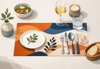
The most polished tables have a focal layer. In many settings, that will be the placemat. If the placemat features expressive artwork, saturated color, or a distinctive border, let it lead and keep the dinnerware relatively quiet. White, cream, stone, or matte black plates create a strong frame for the design without competing with it.
When dinnerware has a decorative rim or bold color, reverse the approach. Use a solid placemat with enough contrast to outline the plate. A woven neutral, a deep jewel tone, or a subtle texture can anchor expressive china without turning the table into a collection of unrelated patterns.
This distinction matters because layered tables need hierarchy. When every item calls for attention, the setting can read as busy rather than elevated. Give the eye one clear place to begin.
Consider Shape Before Pattern
Shape is an easy way to add dimension with restraint. A round placemat beneath a round dinner plate creates a soft, classic silhouette. Rectangular placemats feel tailored and architectural, especially on long dining tables. Oval forms can soften a table with sharp lines while still feeling refined.
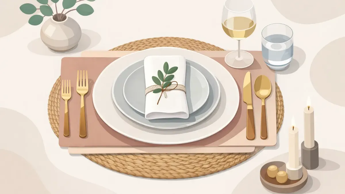
A charger adds another shape layer. It should extend beyond the dinner plate by roughly one to two inches, enough to create a visible border without crowding the placemat. A large charger on a small placemat can look compressed, while a tiny plate on an oversized mat may feel visually lost.
Before committing to a full set, place one setting on the table and step back. The proportions will tell you more than a product photo can.
Build From Large to Small
The simplest method for how to layer placemats is to work from the largest element inward. Begin with the tablecloth or runner, then place the placemat, charger, dinner plate, salad plate, and napkin. This order creates a natural progression and makes it easier to see when the setting needs less.
A runner is especially useful for long tables because it creates a shared centerline while placemats define each guest's space. Choose a runner that contrasts with the placemats in either color, texture, or pattern. For example, a linen runner pairs well with smooth printed placemats, while a clean cotton or matte surface can balance placemats with a painterly design.
At each place setting, keep the stack low enough to feel usable. Two plates and a charger are usually plenty for a seated meal. If you are serving several courses, extra plates can be brought out as the evening progresses rather than stacked at the start.
Balance Color With Purpose
Color is what makes a layered table memorable, but it needs a plan. Start by identifying one dominant shade from the placemat artwork. Repeat that color once or twice in a napkin, a floral arrangement, glassware, or candleholders. The repetition makes the setting feel cohesive without becoming overly matched.
A simple formula is to work with a dominant color, a supporting neutral, and a small accent. A botanical placemat in shades of green and blue might pair with ivory plates, linen napkins in soft moss, and a small touch of brass. A warm abstract design with coral or ochre can be grounded by sand-colored ceramics and clear glass.
Avoid matching every element exactly. Identical tones can flatten the setting, especially when the table is viewed from across the room. Varying the shade or material keeps the composition dimensional. Navy can sit beside dusty blue, for example, and terracotta can pair beautifully with blush or burnt orange.
Mix Patterns at Different Scales
Pattern mixing works when the scales are distinct. Pair a large-scale artistic placemat with a fine stripe, tiny check, or solid napkin. If the placemat has a smaller repeating motif, a bolder floral centerpiece or a broad-striped runner can provide contrast.
What tends to feel less successful is combining two similarly sized, high-contrast patterns in the same place setting. They compete for attention and can make plates disappear into the arrangement. If you love a dramatic runner and a dramatic placemat, introduce plain dinnerware and simple napkins to give the eye a place to rest.
The same principle applies to borders. A placemat with a strong framed edge looks best beneath plates with a clean rim. Decorative-rimmed china often benefits from a placemat without a pronounced border.
Add Texture, Not Clutter
Texture creates the depth that photographs beautifully and feels inviting in person. A smooth, vividly printed placemat can be softened with a washed linen napkin. Glossy ceramic plates feel balanced beside matte flatware, woven chargers, or ribbed glassware. The contrast is subtle, but it makes the setting feel collected rather than assembled from one matching set.
Keep texture practical. Highly textured chargers may be striking, but they can make stemware unstable or complicate a multi-course meal. Likewise, a thick placemat may not be the best choice if the table edge is narrow or if chairs sit very close to the tabletop. A refined table is still meant to be used.
For outdoor meals, weight and maintenance matter as much as appearance. Choose layers that stay in place in a breeze, wipe clean easily, and remain attractive after repeated use. Art-led placemats from SubliLux can bring color and personality to patios and dining rooms alike, while allowing the supporting pieces to stay simple.
Place Napkins With Intention
Napkins are not an afterthought. They can be the softest layer in the composition or the small dose of contrast that completes it. For an uncomplicated daytime table, fold the napkin into a clean rectangle and place it between the dinner and salad plates. It creates a crisp, centered look.
For a more relaxed setting, lay the napkin to the left of the plate or drape it loosely across the charger. This works particularly well when the placemat has a visible border you do not want to cover. A napkin ring can add polish, but choose one with restraint. The placemat, plate, and ring should not all introduce competing shine or pattern.
If the napkin is richly colored, let it echo a smaller shade from the placemat rather than its most obvious color. That quieter connection often looks more considered.
Leave Room for the Meal
A layered table should frame the food, not overwhelm it. Every guest needs enough clear space for glassware, serving utensils, and natural movement. Centerpieces should sit low enough for conversation or be narrow enough that guests can see across the table.
This is where restraint becomes a luxury. Skip the charger for casual pasta night if the plates already fill the placemat. Forgo a runner when the placemat design is the visual feature. Use fewer candles if the table is compact. A setting that breathes will always feel more sophisticated than one crowded with beautiful objects.
For larger gatherings, repeat the same core layers at every seat and vary only a small detail, such as napkin color or place card. The rhythm creates impact, while the variation keeps the table from feeling rigid.
A Few Combinations That Always Work
For an easy everyday arrangement, pair a patterned placemat with a white dinner plate, a neutral cloth napkin, and clear glassware. It is practical, bright, and polished enough to leave out between meals.
For dinner parties, layer a solid runner beneath artful placemats, then add a charger in a complementary matte finish. Choose plates with a clean rim and bring the placemat's accent color into the napkins or candles.
For a seasonal table, start with placemats that suggest the mood rather than relying on literal holiday motifs. Deep florals, warm earth tones, coastal blues, or winter greens can feel timely while remaining useful long after the occasion has passed.
The best layered setting is not the one with the most pieces. It is the one that makes every guest feel that a place was thoughtfully prepared for them. Start with a placemat you genuinely want to see on the table, then let each additional layer earn its place.