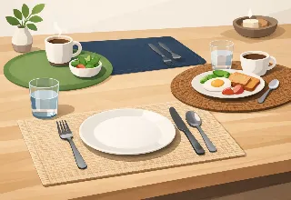
Printed Placemat Review: Art, Finish, and Function
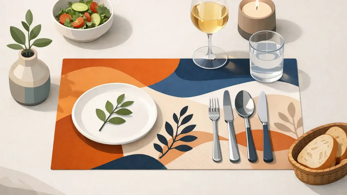
A dining table can look thoughtfully styled at 6 p.m. and completely ordinary at 6:05, once plates, glasses, and serving dishes arrive. The right printed placemat changes that equation. This printed placemat review looks past the pattern alone to consider the details that make a design-led piece worth bringing to the table: color clarity, surface finish, daily practicality, and its ability to make a setting feel composed rather than decorated.
Printed placemats occupy a useful space in home decor. They are easier to change than chairs, less committed than wallpaper, and far more visible than many small accessories. A single set can introduce a seasonal mood, sharpen a neutral dining room, or give an outdoor table the same considered character as the interior.
What a Printed Placemat Should Deliver
A placemat has two jobs. It needs to protect the table from the routine realities of meals, and it needs to hold its own visually when the table is empty. Commodity options often manage the first task. A well-designed printed placemat should manage both.
The distinction begins with the artwork. Good printed designs have intention at every viewing distance. From across the room, the palette should create atmosphere. At a place setting, the composition should remain engaging without competing with the food or making glassware disappear against a busy background. Fine lines, layered botanicals, painterly color, geometric forms, and expressive abstracts can all work beautifully, but only when scale is considered.
A large-scale print can feel dramatic on a generous rectangular table, where each setting has enough breathing room. In a compact breakfast nook, a smaller repeat or open composition usually feels calmer. This is not a rule against boldness. It is a reminder that a placemat is part of a table landscape, not an isolated art print.
Printed Placemat Review: Color and Detail
Color is where printed placemats earn their place in a design-conscious home. Flat, muddy tones can make even a strong motif feel inexpensive. Clear color, thoughtful contrast, and preserved detail give printed artwork its presence.
Sublimation printing is especially suited to art-led tabletop design because the color becomes part of the finished surface rather than sitting on top as a heavy layer. The result can be vivid and refined at once, with tonal variation that suits painted florals, saturated modern graphics, and detailed illustrative work. For buyers who want a setting to feel personal, that range matters.
Look closely at product imagery before choosing a design. Strong print quality is often visible in the transitions: a soft shift from coral to blush, individual leaves within a darker green area, or crisp edges where multiple colors meet. Black should look intentional rather than washed-out charcoal. Creams and pale neutrals should have enough distinction to read as part of the artwork, especially against a light tabletop.
Still, screen color is never a perfect stand-in for a physical object. A bright, sunlit room may make cool blues appear sharper; a warm dining room can pull ivory and sand tones richer. If your table is already a dominant wood tone or colored stone, choose a design that either echoes one undertone or creates a deliberate contrast. Accidental near-matches tend to look less polished than clear coordination.
The finish matters as much as the print
A beautiful pattern cannot compensate for a finish that feels flimsy or overly shiny. The best choice depends on how the table is used. A more structured placemat often delivers a tailored, substantial look for dining rooms and formal hosting. A flexible option may be easier to store, lighter to handle, and more natural for kitchens, patios, or frequent family meals.
Surface sheen is also a styling decision. A subtle finish can bring depth to saturated artwork and wipe clean easily. Too much shine, however, may reflect pendant lights and distract from the pattern. Matte or low-luster finishes can feel more gallery-like, though they may show certain food marks differently. Neither is universally better. Consider the room, the light, and how often the placemats will be moved from table to storage.
Daily Use: Practical Without Looking Practical
No one wants a tabletop accessory that requires ceremony before a Tuesday dinner. Printed placemats should make daily meals easier, not introduce a new maintenance routine.
For most wipe-clean printed styles, prompt cleanup is the simplest habit. Use a soft damp cloth after meals, then dry the surface rather than leaving moisture to sit beneath dishes or along edges. Avoid abrasive scrubbers, harsh solvents, and prolonged exposure to intense heat unless the product care guidance specifically permits it. A placemat helps buffer a table from everyday use, but it is not a substitute for trivets beneath hot cookware.
Storage deserves more attention than it gets. Stacking placemats flat in a clean, dry place helps preserve their shape and printed surface. Avoid placing heavy, textured objects on top for long periods, particularly if the placemats have a smooth finished face. For homes that rotate decor by season, a dedicated drawer or shallow storage bin keeps a favorite set ready without turning it into a creased afterthought.
Durability is not only about surviving spills. It is also about whether a pattern still feels relevant after months of use. Artful designs tend to have greater staying power when they offer a point of view without relying on a fleeting novelty. A richly colored garden motif, a tailored stripe, an expressive coastal abstract, or a graphic pattern in a disciplined palette can move easily from casual lunches to more considered dinners.
How Printed Placemats Change a Table Setting
The most persuasive reason to choose printed placemats is their immediate visual impact. They establish each place setting, create rhythm around the table, and make even simple dishes look intentional. On a plain wood table, a printed design supplies color without hiding the material completely. On white or stone surfaces, it can add warmth and define the dining area.
For everyday styling, let the placemat be the visual lead. Solid dinnerware, clear glasses, and simple linen napkins allow the artwork to set the tone. If the print is understated, you have more room for colored napkins, sculptural candleholders, or patterned plates. The goal is not perfect matching. It is a controlled mix in which every element has a reason to be there.
For entertaining, printed placemats can do much of the work normally assigned to a tablecloth. They are especially effective for small gatherings because each guest receives a complete visual moment. Pair a botanical print with a low centerpiece of clipped greenery. Let an abstract design guide the choice of candle color. For a patio table, choose artwork with enough contrast to remain visible in changing daylight.
There is also a practical advantage to using individual placemats rather than covering the entire table. The table itself remains part of the composition. That matters when you love the grain of a walnut surface, the veining of stone, or the clean geometry of a lacquered finish.
Choosing the Right Set for Your Home
Start with the table, not the trend. Measure the usable surface and leave enough room between settings for elbows, serving dishes, and visual space. A placemat should frame a plate without making the table feel crowded. Shape matters too: rectangular placemats echo long tables and create a clean grid, while round forms can soften angular furniture or suit smaller café-style tables.
Then consider frequency. If your household uses placemats every day, choose a design you will enjoy repeatedly and a finish that supports easy care. If you are selecting a set primarily for holidays, dinner parties, or a guest-ready dining room, you can be more theatrical with color and pattern.
A set from SubliLux is most compelling when treated as tabletop art with a purpose. Choose a design that speaks to the room's existing palette, then allow it to add the element the room is missing: movement, contrast, warmth, or a more memorable point of view.
The best printed placemat is not the one that disappears beneath the plate. It is the one that makes you want to set the table, even when dinner is simple.