How to Choose Placemat Colors for Your Table
A placemat can change the visual temperature of a table in seconds. The same oak dining surface can feel sun-washed and relaxed with sand-colored linen tones, crisp and architectural with charcoal, or expressive with saturated botanical artwork. Knowing how to choose placemat colors begins with seeing the table as part of the room, not as an isolated surface.
The best choice is rarely about matching every item exactly. It is about creating a considered relationship between your table, chairs, dinnerware, lighting, and the mood you want guests to feel when they sit down.
Start With the Table, Not the Placemat
Your tabletop is the largest color field in the setting, so it should lead the decision. A light wood table already brings warmth and texture. Placemats in ivory, sage, terracotta, muted blue, or deep green can create contrast without fighting the grain. Bright white can look fresh here, though it may feel stark under cool overhead lighting.
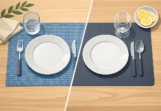
Dark wood, black, and stone tables offer a more dramatic foundation. They are especially effective with lighter placemats that lift the place setting: cream, soft gray, warm beige, pale blue, or artful patterns with a light background. A dark placemat on a dark table can look sophisticated, but only when there is enough difference in texture, sheen, or pattern to keep the layers distinct.
Glass tables behave differently. Because the surface recedes visually, placemats become the main design element. This is a good place for confident color, graphic motifs, and painterly printed designs. On a glass table, a beautiful placemat does not compete with the furniture - it gives the setting its identity.
Choose a Color Direction for the Room
A dining table belongs to a larger visual story. Look beyond the tabletop at the wall color, rug, nearby cabinetry, upholstery, and artwork. You do not need to repeat these shades literally, but a placemat should feel connected to at least one element in the space.
For neutral rooms, placemats can provide the focal color. A set in cobalt, marigold, rust, emerald, or a vivid multicolor print brings personality to white walls, pale wood, and quiet upholstery without committing the entire room to a renovation. This is one reason tabletop decor is so powerful: it offers visual change with very little permanence.
In a colorful room, restraint often looks more luxurious. If your dining area already has patterned drapery, statement art, or richly colored chairs, choose a placemat that pulls out one supporting shade rather than introducing a completely unrelated one. A deep navy placemat, for example, can ground a room with blue accents while allowing patterned dinnerware or flowers to remain the highlight.
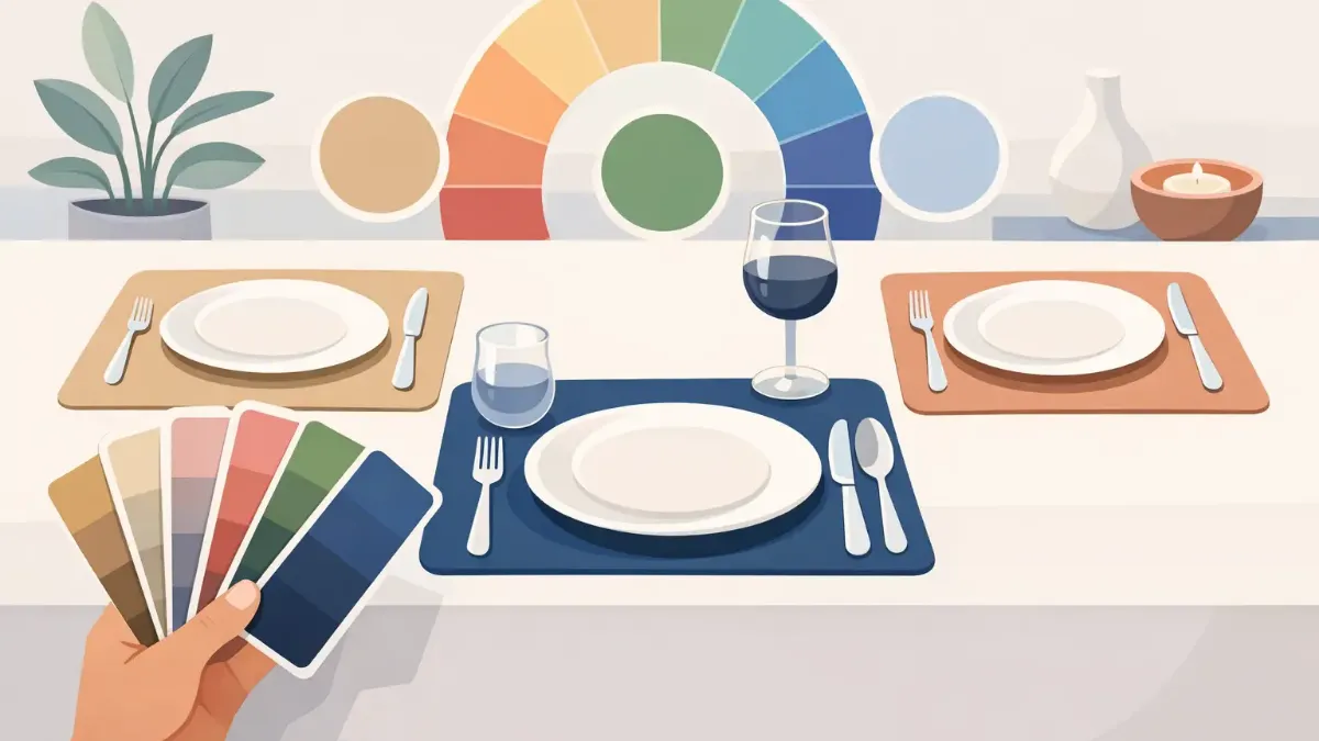
Warm and cool undertones matter as much as the named color. A beige placemat can lean golden, rosy, gray, or olive. Pair warm woods and brass finishes with cream, camel, clay, cinnamon, olive, and warm navy. Pair cooler grays, chrome, blue-black finishes, and white marble with slate, ink, cool taupe, misty blue, and blue-based green. Mixing undertones is not forbidden, but it should look intentional rather than accidental.
How to Choose Placemat Colors Around Dinnerware
Dinnerware is the second major player. If your plates are white or ivory, you have the most freedom. This classic foundation lets placemats carry the color and pattern, whether you prefer a quiet tonal design or a lively artistic composition. White dishes against a richly colored placemat also make food look especially appealing.
If your dinnerware is colored, treat it as a reference point rather than a color you must duplicate. A sage plate can sit beautifully on a clay, cream, charcoal, blush, or botanical print placemat. Repeating sage exactly may create a flat, overly coordinated look unless the materials and values differ substantially.
Patterned plates call for more editing. A solid placemat in a color drawn from the plate is the easiest option. If you want pattern on pattern, vary the scale: pair small, detailed dinnerware motifs with a broader, more open placemat design, or use graphic plates with a softer painterly print. The eye needs one layer to lead.
Metallic flatware and chargers can help bridge a difficult palette. Gold softens warm reds, rusts, greens, and cream. Silver and brushed nickel sharpen cool blues, grays, black, and white. These accents should refine the setting, not rescue clashing colors.
Decide Whether You Want Contrast or Continuity
There are two reliable styling approaches, and neither is universally better.
Continuity uses neighboring shades to create a calm, collected table. Think ivory placemats on a pale oak table with cream plates, or forest green placemats paired with dark green glassware. This approach feels especially polished in minimal interiors and at formal dinners, where texture, candlelight, and food provide much of the variation.
Contrast creates energy. On a walnut table, pale pink, turquoise, ochre, or ivory placemats immediately stand out. On a white table, black, indigo, tomato red, or deep green creates a sharper frame for each place setting. High contrast works well for casual entertaining, patios, brunches, and homes where the table is meant to be noticed from across the room.
A useful rule is to contrast either value or color, not necessarily both. A medium blue placemat on a dark navy table has limited value contrast but clear color variation. A pale gray placemat on a white table has little color difference but enough value contrast to read as a separate layer. When both are too similar, the setting can disappear. When both are too extreme, it can feel overly graphic.
Use Pattern as a Palette, Not Just Decoration
Artistic placemats can solve a common decorating problem: choosing between several colors you love. A well-designed print introduces a curated palette, allowing you to echo one shade in napkins, glassware, flowers, or candles while keeping the table from feeling rigid.
For everyday use, choose patterns with a dominant neutral or a controlled color family. They are more flexible across seasons and less likely to compete with varied meals or serving pieces. A floral print with cream, moss, and muted coral can work from spring lunches through early fall, especially when paired with simple white plates.
For gatherings, a more expressive design can become the occasion's visual anchor. A vivid tropical print suits outdoor dinners and warm-weather celebrations. Deep jewel tones, abstract brushwork, or dark florals add drama to evening tables. The refined color clarity of sublimation-printed artwork makes this approach particularly effective: the placemat can read like a small work of art while still serving a practical role.
Let the Occasion Influence the Palette
You do not need separate placemats for every holiday, but it helps to keep a few mood shifts in mind. Soft neutrals, greens, blues, and organic patterns are versatile for daily meals. They feel composed without looking ceremonial.
For a formal dinner, darker tones and controlled neutrals often photograph beautifully under low light. Black, espresso, deep navy, burgundy, and forest green create a sense of occasion, especially with glassware and candles. If the room is already dark, use a light plate or napkin to prevent the setting from becoming visually heavy.
For daytime entertaining, brighter colors usually have more room to breathe. Citrus, sky blue, coral, leafy green, and sunlit yellow feel natural beside open windows and outdoor settings. On a patio, consider the colors already present in planting, cushions, and exterior finishes. The table should feel like part of the scene, not a disconnected indoor display.
Test the Setting in Real Light
Color selection made on a screen is only the beginning. Before committing to a full table, place one placemat on the surface with a plate, napkin, and glass. View it in morning light, evening light, and under the fixtures you use during dinner. A soft beige can turn yellow beneath warm bulbs; a moody blue can look almost black after sunset.
Also consider maintenance honestly. Very pale placemats offer a clean, airy look but may demand more attention in homes with young children or frequent red-sauce dinners. Deep colors can be forgiving, though they may show lint or crumbs more readily. Patterned designs are often the most practical middle ground because they add visual interest while disguising minor everyday marks.
The right placemat color should make the table feel more like yours, whether that means quiet tonal elegance or a vivid artistic statement. Choose the palette that invites you to set the table more often, linger a little longer, and make an ordinary meal feel deliberately beautiful.