Colorful Table Setting Ideas That Feel Curated
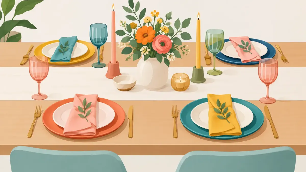
A memorable table rarely begins with the centerpiece. It begins at each place: a saturated placemat, a plate with presence, a napkin that either sharpens the palette or softens it. The best colorful table setting ideas make those individual elements feel composed, not crowded. Color has the power to turn a weekday dinner, patio lunch, or birthday brunch into an occasion before the first course arrives.
For a polished result, think of the table as a small interior. It needs a focal point, visual rhythm, and enough restraint to let the best details register. An art-led placemat offers an easy starting point because it frames every setting while bringing pattern, depth, and personality to the surface.
Start With One Visual Lead
Colorful does not have to mean every shade in the room. Choose one element to lead the composition: a vivid floral placemat, cobalt glassware, a painted runner, or a set of citrus-toned napkins. Then pull two or three colors from that piece and repeat them in quieter ways.
If your placemats feature coral, terracotta, and soft pink, ivory dinnerware gives those tones room to breathe. A coral napkin or a few low pink blooms can echo the design without duplicating it exactly. This approach creates continuity, while small variations keep the table from looking matched straight from a shelf.
Patterned placemats are especially effective in neutral dining rooms. They introduce visual energy without requiring new chairs, paint, or serving ware. On a table with a strong wood grain, marble surface, or heavily veined stone, consider artwork with generous areas of open color. The setting will feel intentional rather than overly busy.
Colorful Table Setting Ideas by Palette
A limited palette is often more luxurious than a rainbow mix. It reads as deliberate, photographs beautifully, and gives everyday pieces a new role. The following directions work across casual meals and more formal gatherings.
Citrus and Sun-Washed Tones
Lemon yellow, tangerine, tomato red, and leafy green bring immediate warmth to a lunch table or summer dinner. Ground the brightness with white, sand, or natural woven accents. Clear glassware keeps the look light; amber glass shifts it toward a richer, late-afternoon mood.
This palette thrives outdoors, but it can brighten a city apartment just as well. Use a striped or botanical placemat as the foundation, then add a small bowl of lemons or a simple green herb bundle instead of an elaborate floral arrangement.
Jewel Tones With a Dark Accent
Sapphire, emerald, garnet, and amethyst make a table feel dramatic without becoming formal in a stiff way. The key is contrast. Pair these colors with black flatware, smoked glass, or a deep espresso table, then introduce cream plates to define each place setting.
Jewel tones suit evening entertaining, fall birthdays, and dinners where the menu is part of the visual story. A bowl of figs, dark grapes, or plums can become a centerpiece that feels generous and quietly theatrical.
Soft Pastels, Made Modern
Blush, lilac, pale blue, and pistachio can feel fresh rather than precious when there is a crisp counterpoint. Try pastel napkins against graphic placemats, or pair a pale blue plate with a bold red water glass. A slim brass candleholder or sculptural white vase adds structure.
Pastels are ideal for spring gatherings and daytime celebrations, but they also work in a modern kitchen with clean lines. Avoid using every pastel at once. Two soft shades and one deeper accent will feel more current.
Earthy Color With a Luminous Note
Ochre, rust, olive, and clay create warmth that works all year. Add a single luminous note, such as turquoise glass, cobalt napkins, or a pink floral detail, and the setting gains lift. This is a useful formula for homes that already favor natural materials and warm neutrals.
The balance matters here. If the table includes linen, ceramics, and wood, a vivid printed placemat can provide the artful edge that prevents the setting from feeling too rustic.
Build Each Place Setting in Layers
A place setting feels elevated when each layer has a job. Start with the placemat, then place the dinner plate, salad plate if the meal calls for it, napkin, glassware, and flatware. Not every meal needs every layer. A relaxed supper may need only a placemat, plate, cloth napkin, and water glass.
Scale is more important than abundance. A large plate on a small placemat can hide the design and make the table feel compressed. Let a visible border of color or pattern remain around the plate, especially when the placemat is the statement piece. Likewise, choose napkins that do not cover the artwork entirely. A loose fold beside the plate often looks more relaxed and reveals more of the composition.
Mixing finishes adds dimension. Matte ceramic plates sit beautifully against glossy printed color; linen napkins soften polished glass; sleek flatware introduces a clean line beside painterly florals. The materials do not need to match. They need to feel chosen.
Use Contrast With Intention
A setting becomes visually flat when every element has the same intensity. If the placemat is bold, keep dinnerware calm. If the plates are hand-painted or deeply colored, use a placemat with a quieter field and a few colors that connect back to the dishware.
Contrast can come from temperature as well as shade. Pair cool blue with warm orange, lush green with pink, or violet with golden yellow. These combinations are naturally high energy, so give them a neutral buffer through white plates, clear glass, or a pale tablecloth.
For a more understated table, work with tonal contrast instead. Layer seafoam with teal and deep navy, or peach with terracotta and wine. Tonal tables feel cohesive from a distance while still revealing depth up close.
Let the Centerpiece Support the Setting
The centerpiece should not compete with the place settings or interrupt conversation. Keep arrangements low enough for guests to see one another, and leave room for serving dishes. A single vase of seasonal branches, a row of small bud vases, or fruit arranged in a shallow bowl is often enough.
Match the centerpiece to the table's energy. Graphic, maximal placemats benefit from simpler flowers in one color. A minimal abstract placemat can carry a more abundant arrangement. Candles offer another layer, but limit tall tapers on a compact table. They look elegant until they block sight lines and compete with the food.
For daytime, a few sculptural pieces of fruit can look sharper than a formal floral display. For evening, candlelight makes saturated colors appear deeper and more dimensional. Test the setting under the lighting you plan to use. A shade that feels bright in morning sun may look muted under warm bulbs.
Set the Mood for the Occasion
The same colorful foundation can shift with the event. For a casual family meal, choose wipe-clean placemats, durable plates, and a low centerpiece that stays out of the way. For a dinner party, add cloth napkins, individual candleholders, and layered glassware. For a celebratory brunch, combine cheerful pattern with one unexpected detail, such as colored coupes or place cards in a contrasting hue.
Outdoor tables require a little more pragmatism. Wind can undo a beautifully folded napkin, and direct sun can make glassware uncomfortable to hold. Use weighted napkin rings, shorter vessels, and color that holds its own against bright surroundings. A placemat is particularly valuable outside because it defines each guest's space on a casual patio table.
If children are joining the meal, do not abandon the design. Choose color-forward pieces that are easy to clean, skip fragile stemware, and make the table welcoming rather than precious. A beautiful table can still be used fully.
Make Everyday Dining Look Considered
The most successful colorful table setting ideas are repeatable. Rather than reserving your favorite pieces for holidays, build a small rotation of placemats, napkins, and glassware that can be remixed through the week. A vivid botanical design may pair with white plates on Monday, then take on a different character with colored ceramics on Saturday.
SubliLux placemats are designed for that kind of visible, practical transformation: artwork that protects the table while making a place setting feel personal. Keep a few neutral anchors on hand, then let color do the changing.
Set the table before the meal is ready, even if the menu is simple. That extra minute creates space to notice what needs editing: one less candle, a better napkin color, a centerpiece moved slightly lower. The goal is not perfection. It is a table that makes guests want to sit down, stay awhile, and notice the care in the details.