Placemats for a Colorful Kitchen That Feel Curated
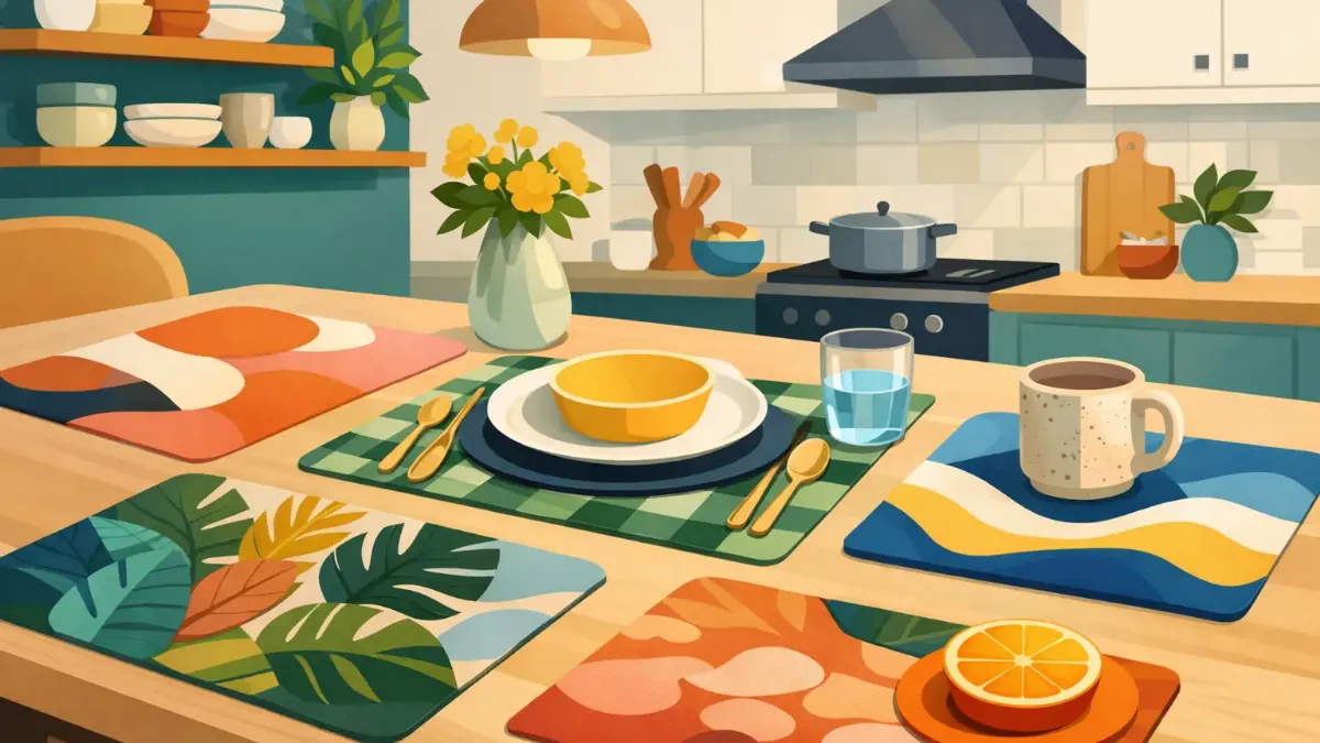
A colorful kitchen already has a point of view. The painted cabinets, tile, artwork, or collection of favorite ceramics have done the hard work. Placemats for colorful kitchen tables should not flatten that personality with a cautious neutral or compete with it in every direction. The right set gives the table a deliberate role in the room: artful, practical, and fully part of the composition.
A placemat is a small surface with outsized visual influence. It repeats at every place setting, frames the dinnerware, and appears in nearly every view of a kitchen table or island. Choosing well is less about finding a color that matches everything and more about deciding what the table should add.
Start With the Kitchen's Dominant Energy
Before choosing a pattern, look at the room as a whole. A colorful kitchen may be high-contrast and graphic, softly layered in warm tones, or filled with bright accents against a quiet backdrop. Each calls for a different placemat approach.
If cabinetry or walls make the strongest color statement, a placemat can create a visual pause. Rich navy, deep forest, terracotta, or warm cream may pull the room together without becoming invisible. A restrained ground does not have to mean a plain one. Fine botanical forms, painterly texture, or a subtle geometric repeat can bring dimension while letting the kitchen lead.
When the room has a mostly neutral foundation with colorful glassware, art, or accessories, the table can carry more of the energy. This is where saturated florals, graphic checks, abstract color fields, and expressive motifs earn their place. The placemats become a focused, changeable dose of color - a useful option for renters, apartment dwellers, and anyone who wants impact without repainting a room.
The most successful choice usually echoes one existing note rather than attempting to repeat the entire palette. A blue detail in tile can reappear in an indigo border. The warmth of wood can be picked up by ochre or rust. A small connection makes an eclectic room feel composed.
Choose Contrast Before You Choose a Match
Matching is easy to understand, but contrast is often what makes a table setting feel designed. Consider the relationship between the placemat, tabletop, and plate as three separate layers.
A dark wood table with white plates benefits from a placemat that sits clearly between them: a bright pattern, a warm midtone, or a color with enough depth to hold its own. On a pale table, darker artwork or a strong border gives dinnerware definition. If both the tabletop and plates are colorful, a placemat with a calmer background may provide welcome structure.
Contrast can come from value, pattern scale, or material impression, not just hue. A low-contrast palette in varied textures can feel refined and relaxed. A bold cobalt placemat beneath simple ivory stoneware feels crisp and graphic. Neither is inherently better. It depends on whether the kitchen needs more calm or more punctuation.
For a quick visual test, place a dinner plate on a sample or digital image of the placemat. If the plate disappears, the pattern may be too busy at that scale. If the placemat vanishes completely, it may not be doing enough for the setting. The ideal balance lets both elements read clearly.
Let One Pattern Take the Lead
Patterned placemats are especially effective in colorful interiors because they connect shades that might otherwise feel separate. Yet a pattern should have a job. A large-scale floral can soften square cabinetry and hard tile. A clean stripe can give a casual kitchen a tailored edge. An abstract design can introduce color without the formality of a traditional motif.
When surrounding surfaces are already patterned, such as veined stone, checkerboard flooring, or decorative backsplash tile, choose a design with more breathing room. Conversely, a plain table and simple dinnerware can support a more intricate artistic print. The aim is not to eliminate visual variety. It is to keep the eye from having to solve too many competing focal points at once.
Placemats for Colorful Kitchen Tables Need Staying Power
A vivid table setting should look just as inviting after a weekday breakfast as it does for a dinner party. That makes finish and maintenance part of the design decision, not an afterthought.
Look for artwork with clear color and a surface that suits daily use. Premium sublimation printing is particularly appealing for art-led placemats because it creates saturated, detailed imagery with color integrated into the finished design. It supports the kind of nuanced gradients, crisp lines, and expressive palettes that make a table feel personal rather than mass-produced.
Easy care matters, especially in homes where the kitchen is the center of daily activity. A placemat that can handle drips, crumbs, and frequent wipe-downs is more likely to stay on the table, where it can actually transform the room. For formal entertaining, you may favor a more delicate-looking layered setting. For everyday use, practicality gives you permission to choose color without worrying that it must be saved for special occasions.
Shape also changes the mood. Rectangular placemats bring order to a long dining table and work naturally with place settings arranged in a row. Round placemats soften angular kitchens and suit bistro tables, breakfast nooks, and casual gatherings. A shaped silhouette can be charming, but it is best used when the rest of the setting remains edited.
Build a Table That Can Change With the Season
A colorful kitchen does not need one permanent placemat solution. In fact, rotating a small collection can make the room feel renewed without adding clutter or committing to a full decor overhaul.
For spring and summer, botanical greens, citrus tones, painted florals, and breezy blues pair beautifully with fresh produce and outdoor meals. In fall, rust, wine, olive, and deep gold make the table feel warm beside wood, brass, and candlelight. Winter does not require abandoning color. Jewel tones, midnight blue, berry shades, and graphic black-and-cream designs create a more intimate atmosphere while remaining expressive.
The trick is to preserve one visual thread across the rotation. It might be a preferred shade of blue, a love of hand-painted-looking motifs, or a consistently modern graphic sensibility. This keeps seasonal styling from feeling like a completely different kitchen every few months.
Edit the Rest of the Table
Once the placemats are expressive, let the remaining elements support them. Everyday white or ivory dinnerware is an excellent companion because it lets the artwork show through while keeping meals visually easy. Colored plates can work beautifully too, particularly when they repeat a smaller tone from the placemat rather than its dominant shade.
Keep napkins simple when the placemat pattern is elaborate. If the placemat is quiet, a saturated napkin or sculptural napkin ring can add another layer. Glassware is a useful place to introduce sparkle or a second color, but restraint helps. A table with colorful placemats, patterned plates, bright napkins, and heavily tinted glass can feel festive, yet it can also become visually crowded.
Centerpieces deserve the same editing. A bowl of lemons, a low cluster of flowers, or a single leafy branch is often enough. The placemats have already established the table's visual character. The centerpiece should give the setting life, not obscure the work beneath it.
Treat the Table as Part of the Room
The best placemats do more than protect a surface. They make the table feel connected to the kitchen's color story, whether the setting is prepared for two on a Tuesday or for a crowded weekend brunch. They offer a design decision you can change easily, use often, and enjoy from the moment you walk into the room.
SubliLux approaches that everyday surface as a place for art, not an afterthought. Choose a design with enough color to make the table feel intentional, enough contrast to frame the meal, and enough durability to become part of how your home is actually lived in.