How to Style Table Placemats With Intention
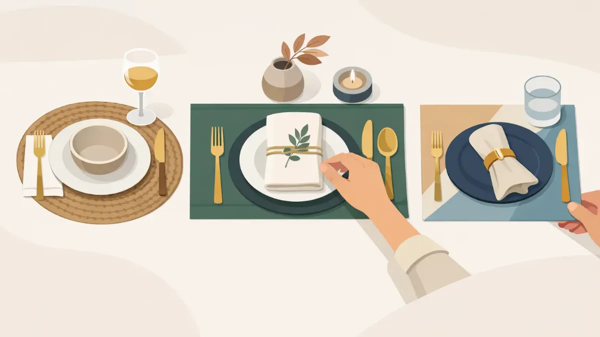
A table can feel finished before a plate ever reaches it. That is the quiet power of a well-chosen placemat: it establishes color, scale, and mood in one move. Learning how to style table placemats is less about following formal rules and more about composing a setting that feels considered, useful, and distinctly yours.
For everyday meals, that might mean a graphic pattern against simple white dinnerware. For a dinner party, it may be a rich, art-led layer that gives the entire table a point of view. The best settings leave room for food, conversation, and ease while still looking intentional.
Start With the Table, Not the Place Setting
Before choosing a placemat, look at the surface beneath it. A warm wood table already brings texture and depth, so a crisp geometric print, fine stripe, or clean solid can create welcome contrast. Glass and lacquered surfaces tend to benefit from placemats with visual warmth, whether that comes from saturated color, painterly detail, or a tactile-looking pattern.
A patterned tablecloth changes the calculation. If the cloth is expressive, choose placemats that pull out one or two colors from the print rather than competing with it. If the cloth is solid, placemats can carry more of the visual energy. This is not a rule against mixing patterns. It is a reminder to give one layer the leading role.
Consider the room, too. Dining tables are rarely isolated design moments. A blue-and-ochre placemat can echo a nearby rug or a framed artwork. A botanical design can soften a modern kitchen or connect an indoor table to a leafy patio. When the table speaks to the room around it, the setting feels designed rather than decorated for a single meal.
How to Style Table Placemats by Color
Color is often the fastest way to shift a table from casual to elevated. Start with a palette of two or three main tones. One can come from the placemat, one from the dinnerware, and one from a small accent such as a napkin, candle, or floral stem. More colors are possible, but they need a clear relationship. A setting with five unrelated shades can feel accidental, even when every item is beautiful on its own.
For a calm, polished look, pair tonal colors: sand with ivory, slate with soft blue, olive with cream. The result is layered without becoming busy. For more energy, choose a high-contrast pairing such as cobalt and white, terracotta and deep green, or black and warm natural wood. A vivid printed placemat is especially effective here because it can introduce contrast without requiring new dishes or a full table linen collection.
White dinnerware is the most adaptable companion to artistic placemats. It lets color and pattern show clearly, keeps the table from feeling overloaded, and works for everything from weekday takeout to a formal holiday meal. If you prefer colored plates, use them as a frame for the placemat rather than a rival. A solid plate that repeats a shade within the mat usually feels more composed than a second bold print.
Seasonal styling does not require obvious motifs. Instead of filling an autumn table with literal leaves, try rust, plum, moss, and cream. For spring, look to fresh green, pale blue, citrus, or floral-inspired tones. Summer welcomes brighter contrast and relaxed stripes, while winter can lean into deep jewel tones, charcoal, ivory, and metallic accents. The table can acknowledge the season without becoming theme-heavy.
Build Layers With a Clear Hierarchy
Placemats work best when they have enough space to be seen. Center each one at a seat, then place the dinner plate in the middle so an even border remains visible around the edges. That reveal is what makes the mat feel like a design layer instead of a protective pad hidden beneath dinnerware.
Round plates on rectangular placemats create an appealing contrast, especially when the placemat pattern is clean or directional. Square plates can look striking on rectangular mats, but the geometry is more pronounced, so keep the rest of the setting restrained. If your plates are large, make sure the placemat has generous proportions. A small mat under an oversized plate looks cramped and offers little visual benefit.
Napkins should support the composition. Fold a cloth napkin simply beside the plate, lay it across the center of a plate, or use a low-profile ring for an occasion that calls for a little polish. Avoid building height at every seat. Tall folds, large napkin rings, and bulky place cards can make a table feel crowded before serving dishes arrive.
Chargers are optional. They add ceremony and can be useful for holiday dinners or more formal entertaining, but they are not necessary when the placemat itself is visually strong. If you use both, let one be quieter. A simple charger under a richly patterned placemat can work, although a plain plate directly on an expressive placemat often feels fresher and more modern.
Mix Pattern and Texture Without Losing the Plot
The most memorable tables often combine materials and motifs, but balance matters. A painterly placemat can sit beautifully beside matte ceramic plates and linen napkins because each element offers a different kind of texture. A tightly geometric design can pair well with smooth glassware and uncomplicated flatware. The goal is contrast with restraint.
When mixing patterns, vary the scale. A large-scale floral or abstract print has room to breathe next to a narrow striped napkin. Two medium-scale patterns with similar intensity may compete, especially across six or eight place settings. If you love both pieces, separate them with a solid plate or a quiet runner.
A runner can create a useful central axis, particularly on a long rectangular table. It should not duplicate every color in the placemats. Choose a neutral runner to ground bold mats, or use a single color from the placemat artwork to bring the setting together. On a round table, a low centerpiece often does the same job without requiring a runner at all.
Style for Real Meals and Real Guests
A beautiful table still needs to function. Leave enough room for glasses, shared dishes, and elbows. On smaller tables, skip oversized centerpieces and keep the middle low and narrow. One sculptural bowl, a few votives, or a compact arrangement can create atmosphere without interrupting sightlines.
For outdoor dining, placemats are particularly valuable because they visually anchor lightweight plates and casual glassware. Choose designs with enough color or contrast to hold their own in bright daylight, then keep the rest easy: folded napkins, simple drinkware, and a centerpiece that will not topple in a breeze. A relaxed table is not an under-styled table. It simply avoids unnecessary ceremony.
For larger gatherings, repeat the placemat design across every setting and vary only small details, such as napkin color or a seasonal stem. Repetition creates cohesion quickly. If you are setting a holiday table with family heirloom dishes, modern art-led placemats can make those familiar pieces feel newly relevant without diminishing their character.
At SubliLux, the appeal of artistic placemats is precisely this flexibility. They can become the focal point of the table, then shift easily between daily use, gifting, and entertaining without asking you to redesign the room.
Know When to Keep It Simple
Not every meal needs a fully layered table. If the menu is abundant, the placemats can do the decorative work while everything else stays quiet. If you are serving highly colorful food, such as a summer salad spread or a richly garnished brunch, choose a subtler design so the meal remains the visual center.
Likewise, a dramatic placemat deserves restraint elsewhere. Skip competing patterned plates, use clear glassware, and limit the centerpiece to one material or color family. Conversely, a neutral placemat gives you permission to bring in bolder flowers, colored candles, or expressive serveware. Styling is a series of trade-offs, not a test of how many beautiful objects can fit on a table.
The strongest setting is one you will actually use. Set out the placemats for a Tuesday dinner, not only when guests are coming. Let the artwork under each plate make an ordinary meal feel a little more deliberate, and let that simple ritual shape the room around it.